This page is my children at a mini water park. I used the "splashing good fun" title and I love the effect of cutting the photos on angles.


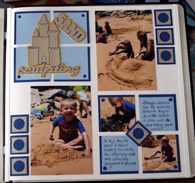
This is my son making sand castles last summer. I used the sand sculpting title and then recreated the squares to make the page balance.

My Mum bought my kids their first surf boards this past summer so that is why the surfs up title was created.

Ahhh, my little superhero. Title was cut exactly as shown here on the blog and the spiders were a simple trace off a spiderman shirt.
Anyhow I hope you like them and can maybe get some ideas for your own layouts


No comments:
Post a Comment